In December, the Pantone Institute announced a fresh, sparkling yellow-green hue called Greenery (we call it “greenhouse” or simply “green”) as the color. The main message from the experts is “Get closer to nature.” Frankly speaking, I was madly happy about this choice, because it is involuntarily associated with the first days of spring, when nature comes to life and begins to renew itself. But after a while the euphoria has gone, and I realized that the shade is kind of cool, but still pretty specific, too colorful and difficult to work with.
Designers, as well as clients, are in no hurry to use it in their interiors. In fact, with the right approach Greenery is really able to revive the space, make it incredibly attractive and “tasty”. I propose 4 ways, which will perfectly bring this shade into the interior, without making it too provocative:
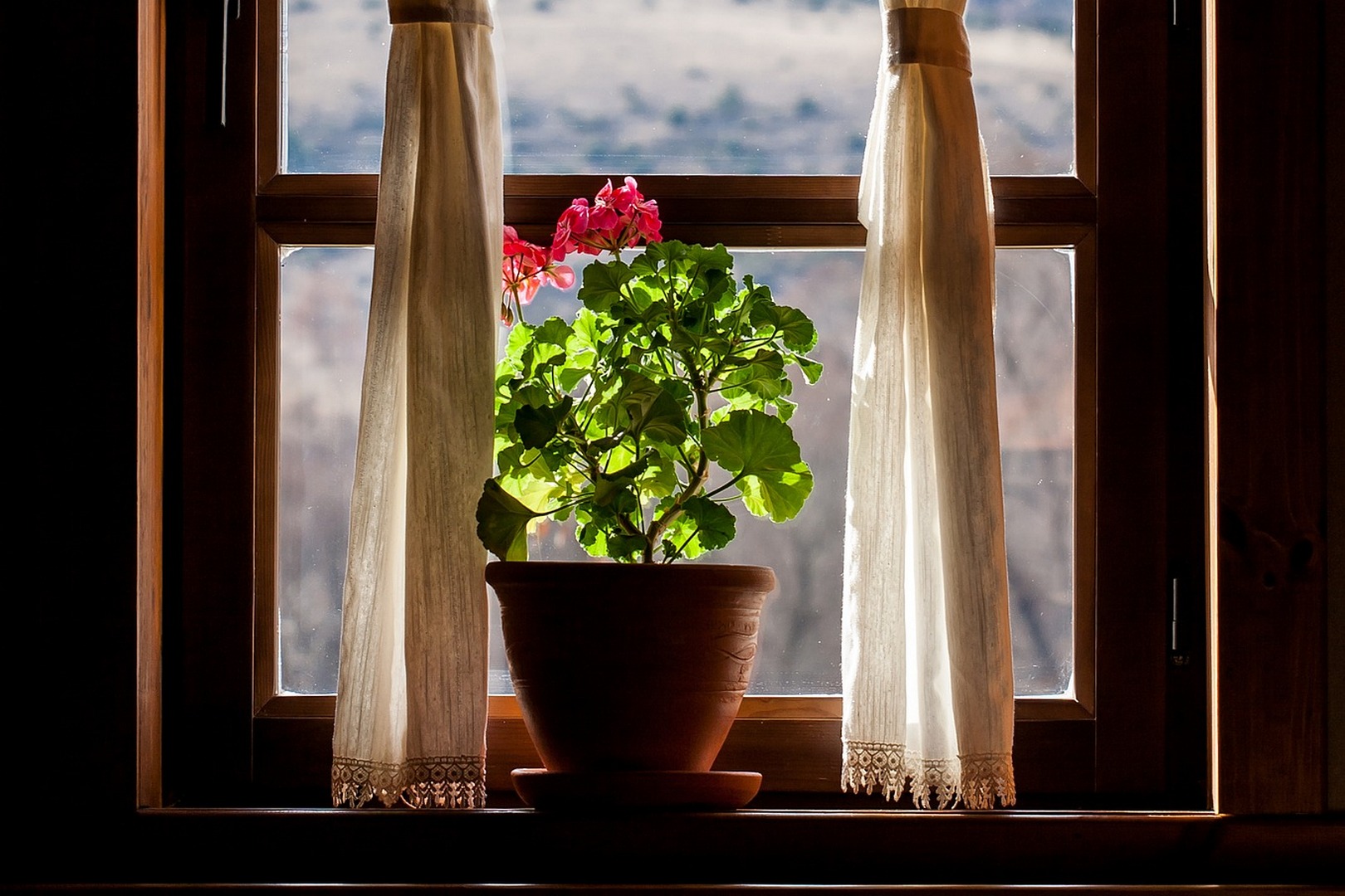
This is the most obvious way, but also the most harmonious, in my opinion. Nothing will look as natural and appropriate in an interior as live plants and trees. In general, I am of the opinion that any room with even a small amount of vegetation already looks more stylish a priori. In a year, two or five years, many people won’t remember that Greenery was a trendy color, but the greenery will definitely remain out of fashion and time. So, regardless of the style in which your interior is decorated, I advise you to get a couple or three different representatives of flora.
I can advise @levi_flower, where Liya and Zhenya, a married couple, make insanely beautiful florariums (some of them are even hanging), plants in glass frames and a lot of other pretty things.
beautiful photos or prints of plants framed in simple frames;
The palm leaves in a vase (if last year there were banana leaves everywhere, now the monster in all its forms took the palm. Does everyone know what kind of plant this is? I remember it very well from school, in our biology class thanks to it grew really impenetrable jungle!) It’s nice that these leaves can stand in a vase for a long time and give pleasant emotions with their presence.
I advise not to paint all surfaces in such an uneasy green shade, otherwise without professional help it can be a disaster. If you really want to have a spring mood, then limit yourself to one accent wall.
And even better (I fell in love with this option long before the announcement of the color of the year) – pick up the wallpaper with a large print in the form of palm leaves. For example, Cole&Son has a beautiful botanical series Palm Jungle. In order not to get bland, the interior in general should be neutral, made in white or gray tones.
In large quantities the shade Greenery will look good in children’s rooms, kitchens and bathrooms (with walls of this color your morning will definitely start bright and cheerful). But, in any case, do not forget to dilute such a space with neutral shades, for example, white surfaces will be a great addition.
Now, with the approach of spring it would be very relevant to get new bright curtains of Greenery shade, or, if you want something less radical, covers for decorative pillows with some unobtrusive plant prints or colorful towels for the kitchen. By the way, linens with green flecks will also add to your spring mood on a daily basis.
I really like this shade in combination with soft and pleasant to the touch materials, especially with velvet, which is also very popular now. For a long time you wanted to update the sofa or chairs in the dining area? Why not choose something stylish, with a sleek silhouette and velvet upholstery in a fresh lettuce color! Here again, pay attention to keeping the whole setting neutral while doing so.
Please share your opinion on this shade, do you like/dislike it? Is the color green present in your home now and would you like to have more of it around you now?
